This company advocated split testing, and at the stage we joined to consult, there were 4 flows being tracked and analysed.
Reviewing the flows, screens and analytics (such as conversion rate click-throughs) meant that I understood the product’s uses and had key takeaways to begin considering which flow (if any) was best to develop and improve upon.
Above: Mind-map summarising findings from researching museums. These include a brief summary of positives and negatives of the site.

Above: Mind-map showing findings from researching car park booking forms. Sketches accompanied with screenshots.
Analysing competitors is integral for understanding the market and how content is presented.
The majority of competitor analysis I do is building on clients' own research and is therefore more informal as it is mainly to develop my own comprehension of the market and designs. Sometimes there needs to be a more in-depth study for the client, in which case producing metrics to understand the alternatives and their competitive positioning is ideal.

Above: Mind-map of a primary persona who uses a museum website.

Above: Mind-map of secondary personas from a sister site to the museum, who use the site less frequently.
Clients sometimes provide us with research reports created by specialist research agencies. I review, summarise and present the reports to the team in order to gather the key insights into different personas and their user journeys.
These two images are from a two week sprint project. I presented the 100 page research report in mind-map style, so umbrella topics and information is available at a glance.
For the secondary personas (image 2), I assembled the information from the five personas into umbrella topics (such as needs and goals) to see which appeared repeatedly and should be considered in the design.
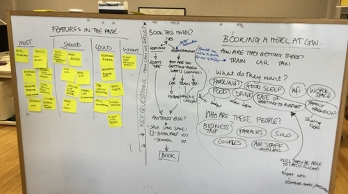
From these maps and my presentation to the team, we undertook a white-boarding session where we categorised and prioritised features and navigation for the primary and secondary users of the site.

Above: Analytics, competitor research, testing feedback, journey maps and initial thoughts of wireframes. The clients particularly liked the journey map from video testing, as it clearly showed where the product needed improvement.
User testing techniques vary with topics and clients. Many have limited budgets, some prefer for their team to test directly with clients whilst others provide analytics. Adapting to these limitations means that I am still able to get the most out of the feedback provided.
User testing feedback has come from specialist user testing professionals, informal testing with the team and acquaintance, google analytics, client testing, and online testing videos. Although some are not always ideal, they provide useful feedback and inform further development.

Above: White-boarding session. On the left hand side: MoSCoW exercise. On the right hand side: highlighting flows and user needs for prioritisation.
Performing a MoSCoW feature prioritisation exercise works by reducing the amount of features per iteration, so that all key elements are included and given appropriate weighting. Doing this as a team exercise is particularly beneficial as it opens up debate and discussion on how the product will develop.

Above: Site-map - this specifically was used in a pitch for a company with a vast amount of content and even sub-sites. Although complex, this proposed nav provided a clear structure for the site.


Above: Navigation and wireframe sketches used to decide on placement and structure of the navigation.
A site needs structure and hierarchy. To sort content, I use sitemaps to plot primary navigation for main topics, secondary nav and sometimes tertiary for sub-topics (if a large site).
Navigation and sitemaps go hand in hand. Understanding the hierarchy levels within the site means that the structure and layout can be produced.


Above: Three versions of wireframes. Left to right: Low fidelity prototype with post-it's to see the best placement of internal booking tool, centre initial digital mock-up using Balsamiq, right a version of the wireframe in a later development stage (focus here was on the header and booking tool).
I produce wireframes on paper, and then digitally using tools such as Balsamiq, Sketch or Photoshop (depending on fidelity). These screens are generally part of a flow and uploaded to a prototyping tool (generally Invision but sometimes Marvel) so that screens can be connected with hotspots, and used for testing. Lower fidelity wireframes are quick to produce and explanatory enough for the user test.